YCHARTS
Project Scope: April, 2021 - August, 2022
Project Type: Full Time Work
Responsibilities: User Research, UX + UI, Product Design

Project Overview
YCharts is a financial research platform built for advisors, asset managers, and investors to make smarter investment decisions and build better portfolios. As a designer, my role in this grand project is to communicate with the YCharts founders and product owners to redesign the look and feel for a modern and user-friendly upgrade. I also participate extensively in their process of new product development and brainstorm innovative design ideas that are also intuitive for investors.

Project Delivery
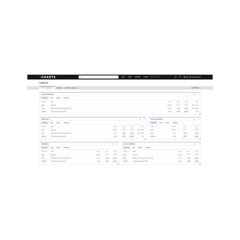
Throughout my time working on YCharts, I have successfully delivered many products, Economic Indicator, Economic Calendar, Tear Sheets, Account Setting, Fundamental Chart and more. All of these were welcomed and received many positive feedbacks from the loyal users of the platform.
Economic Indicator + Economic Calendar
Economic Indicator and Economic Calendar are tools that aim to give users a pulse of important economic events that are happening around the globe. It provides a good overview of the current global economic state and allows users to browse through the major releases of the day.

Before
After
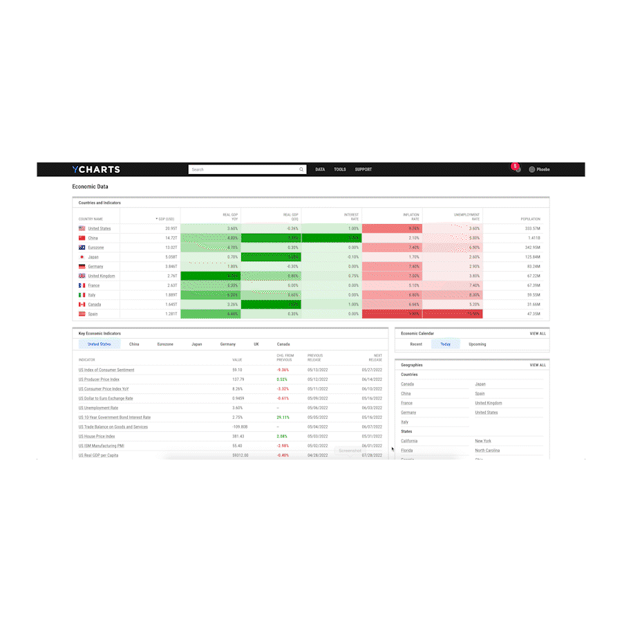
Economic Indicator
The challenge of this project lands on the nature of this page:
Economic Indicator hosts a mass amount of data, consisting from indicators, events, financial data based on categories and geographies.
End goal:
Preserving the browsability and all of its data of this current page, while reducing visual fatigue from browsing through lists of data by creating an organized structure and data hierarchy.
By interviewing our frequent users of this page, we were able to gather important findings and discrepancy that are set between the earlier version and users' expectations for this page.

User feedback:
-
Many users are often looking at just data from the United States. It would be very helpful if the data from the United States was highlighted in some ways so that it is easier to browse.
-
Would love to see important indicators so users can get a sense of the global happenings at a glimpse.
-
Would love to see some visual indications.
-
Would love to see an informational hierarchy. The page looks very messy.
-
Hard to find things on Sources, Reports and Geographies pages.
Solution:
-
Host a comparable table that compares United States to the rest of the major countries on the top of the page, highlighting popular indicators such as unemployment, housing, rates and consumer confidence, etc.
-
A color system for heat map was designed to be incorporated on the page, as a more obvious indication of the positive and negative changes.
-
Added visuals for each country for easier read.
-
Added lines and spacings to break up the space.
-
Better organization of the modules for better flow.
-
Alphabetically sorted Sources, Reports and Geographies pages for an easier search.


Economic Calendar
The original design for the Economic Calendar is outdated and displays data in a spreadsheet fashion without any visual hierarchy. One of the biggest problems I see here was the fact that the users have hard time starting with this page. Filtering events into days was the first step of this organization. Designing these days into "cards" not only enhances the usability, reduces the redundancy, but it also provides an access for users to click on these cards to open up the included events and an introductory point to start browsing through the page. A region filter was also added so users can filter through all regions. Users can also flip through dates in the newly implemented time range section.

Before

After

Fundamental Chart
The charting applications are among the most popular tools on YCharts. Many influencers share their insights on social media using charts generated by YCharts, demonstrating the tool’s intuitiveness and data prowess to their followers. The tool offers brand exposure in the market and becomes a source of demand generation.
Not many new features were introduced to the app since the last major upgrade. While the existing app satisfies many essential use cases, it does not give the users enough flexibility with their charts, such inconvenience could be solved by adding mark-up and line customizations.
For example, users often need to edit the chart generated by YCharts in another application. It disrupts their workflow and creates a user habit the team wants to avoid. With the constantly changing market landscape, YCharts faces the challenge of lagging behind competitors.
Updated Functionalities
-
A scrollable time range selector at the bottom of the chart, an enhancement to the current time and date range selector on the top of the chart, for a more specific and detailed selection.
-
Crosshair tool that enables users to see exactly where the mouse is pointing, allows a more accurate display of a data point.
-
A set of newly-designed tools, such as text, shapes, and lines tools were implemented to give users ability to evaluate the patterns in trading data conveniently and locate new trading opportunities.

ESG
ESG data has a growing popularity among the financial industry and YCharts's user base. According to Morningstar, AUM in ESG strategies has grown over 600% in the last decade. European Union recently implemented the Sustainable Finance Disclosure Regulation, which seeks to promote transparency around the financial firms’ sustainability disclosures in order to counter “greenwashing.” It is expected that U.S. regulators could follow suit in the future. YCharts currently do not offer any in-depth ESG data on its platform and the lack of data is a pain point for users who wish to understand securities’ ESG involvements and make better investment choices based on ESG criteria.
By partnering with ESG data providers, the team selected the most valuable data, combining with the newest designed ESG icons and visuals created for YCharts, ESG page is here to evoke emotions, tell a story, and work towards a better future.


Tear Sheet
Tear Sheet is a one page summary of Model Portfolio. It includes key fundamental information and provides highlighted insights on historical performance. Challenge designing these sheets lands on the density of information that needs to be presented within limited space. In order to make these visually digestible and instantly understandable during portfolio analysis or review discussions, I studied these data and devised a hierarchy so that it will read easily from the top down and broke down smaller sections underneath to create a flow. A set of visuals like pie chart and bar chart help for an easier digest of mass data, and I added an addition of a grey background for a cleaner separation between each section.
